UX DESIGN RESEARCH: CHEFME
Effects of Food-related Mobile App UX Design on User’s Perception:
Design experiment with ChefMe Prototypes
Abstract
To understand the influence of UX design on food-related mobile app, this study examines how design elements like colour, layout and content impact users' perceived usefulness, ease of use, willingness to use and share. For this purpose, ChefMe is proposed as a prototype of an app that allows users to explore recipes and interact with other users. 12 different prototypes of the ChefMe app {3 colours x 2 layouts x 2 contents} were produced and one was randomly shown in a survey. The survey was distributed via social media and 199 participants voluntarily participated. T-test and ANOVA were then used to test the hypothesis. The statistical results found that colour and interface layout respectively impacts users' impression with the app overall while content authorship impacts users' perception with the recipes. Specifically, the colour red, an image-based interface layout and a combination of firm and user-generated content are found to be significantly influential on the perceived satisfaction of the ChefMe prototypes.
Link to ChefMe app proposal: https://bcpriscillato.wixsite.com/chefme

LITERATURE REVIEW
The design of an app is essential to the overall user experience, acceptance, perception and interaction. Wu and Li state that a useful app should have a smooth and modern interface with various styles (2019). The design must be standardized to reduce the cost of learning while also implementing interactive styles to ensure time appropriateness. Humanized design concept should also be included in the development of an app. Wu and Li also establish five interface models which require specific design, layout and elements for it to be effective. 1) Startup interface should clearly state the service and functions of the APP. 2) The top-level interface should display the hierarchy of functions within the app to allow users to navigate to other interfaces. This interface is the first impression of the whole APP so branding design is critical. 3) Overview interface is the continuous display of information. Simple controls should be implemented to let users easily search for required information. 4) Detailed information interface shows detail of a specific piece of information which is lower in the hierarchy. 5) Input and operation interface performs actions based on the user’s command, for example, text input. Ease of operation and reduction in misoperation is essential in this stage (Wu & Li, 2019).
For food-related applications, Lee, Lee, and Joen (2017) stated that user-generated information, firm-generated content, system and design quality impact the perceived ease of use and usefulness for users. They also argued that unlike websites, mobile apps are much smaller in size; hence minimal design and data communication process are essential while font, composition, and colour serve to impact user’s perception.
Moreover, colour is especially important in food perception. Elliot and Maier (2014) outline the power of colour in impacting people’s cognition and behaviour. Especially colour in food serves for flavour identification and intensity as colour impacts the expectations of the taste of food. Colour of tableware is also essential in food perception. They stated that red has a dominant effect and gave examples that coffee is seen as warmer in a red cup, while people eat fewer snacks from a red plate. Colour contrast and colour match conditions are also critical. For example, people serve themselves less food when putting red pasta on a white plate and white pasta on a red plate. Other studies argue that red colour increases appetite while blue decreases (Hunjet & Vuk 2017). Hunjet and Vuk (2017) also state that the colour choice of different restaurants serves different purposes. For example, fast food restaurants use red to stimulate appetite and yellow to gain customers' attention. Whereas formal restaurants usually employ a blue colour to create a relaxing environment so customers will linger longer.
Accordingly, this study aims to question whether a different colour choice, interface template and content authorship would influence users' evaluations of the mobile app. By manipulating those design elements in ChefMe prototype design, the experiments are designed to examine how users perceive the interface design as useful. The details of hypotheses are in the following:
HYPOTHESIS
Research problem
What color choices, template layout and content design will increase user’s perceived usefulness of the ChefMe app?
Hypothesis 1: How will color choices impact the perceived usefulness of the ChefMe app?
Independent variable: color
Dependent variable: perceived usefulness
Satisfaction
Click rate
Willingness to pay
Frequency of use
Perceived well being
Initial hypothesis: Using a soft-shade red will increase user’s perceived usefulness of the ChefMe app. This is because study shows that red stimulate appetite, which will increase user’s frequency of use. While since blue is said to increase duration of stay in restaurants, a pastel tone will be applied to the red to create a calm tone to the strong red.
Hypothesis 2: How will interface layout and elements impact the perceived usefulness of the ChefMe app?
Independent variable: interface template
Dependent variable: perceived usefulness
Ease of use
Frequency of use
Satisfaction
Initial hypothesis: Incorporating a simple, consistent and representative screen design of cooking will increase user’s perceived usefulness of the app. Simplicity is important especially for mobile apps as study found that minimal design in font, composition and color impact user’s perception. Being consistent with what users are used to is critical as an app should be effortless of users to navigate. Implementing representative elements of cooking will also state the purpose of the app and stimulate interest as study shows that branding in the design of an APP is very important.
Hypothesis 3: How will content design impact the perceived usefulness of the ChefMe app?
Independent variable: content
Dependent variable: perceived usefulness
Satisfaction
Perceived credibility
Frequency of use
Initial hypothesis: Including firm-generated content will increase credibility for the app while user-generated information can create interest and a community among users. Study shows that user-generated and firm-generated content impact the perceived ease of use and usefulness for users.
TARGET USER
User Persona & Scenario

Usage Scenario (1): ASAP Meal
Kaitlyn came back from her work late and is in a hurry to meet her friends to go out at night. She only has 1 hour to make her meal and eat before she leaves the house.
She opens the fridge and realizes that she only has a few ingredients left from her last grocery trip and is unsure with what she could cook with the limited things she has.
She then inputs the few ingredients she has: chicken, broccoli, pasta and pesto into ChefMe, she also specified the calories count of 600, serving size of 1 and a cooking time of 30 minutes. The app immediately generated a few recipes that follow her specifications.
Kaitlin then chose the recipe that she thinks was most suitable for her night. She then checked the comments and reviews of this recipe and decided she wants to make a chicken pesto pasta with broccoli. Following the detailed instructions with video guidance, she began to cook.
After she cooked her meal, she immediately took a photo of her finished meal and posted it on the ChefMe sharing platform and rated the recipe. This allows her to share with her friends her proud meal of the day. She then proceeded to eat her meal, got ready and left. On her way to the party, she received compliments on the meal she made through the app.
Usage Scenario (2): Preparing for a potluck
For a sisterhood event, Kaitlin’s sorority decides to make a huge potluck where everyone has to contribute and bring a home-cooked dish to share. Kaitlin and her roommates, therefore, decides to go grocery shop for their individual dishes.
At the grocery store, Kaitlin is unsure what she should make hence buy, so she opens up ChefMe for advice. Since she has to make big enough portions for all her sorority sisters, she decides to make something simple, with few ingredients. So she goes on the “Simple, Easy, Fast” tab on the app and clicks into the “3 ingredients recipe”. She then browses through the list of suggested recipes based on her previous preferences and chose “Baked Ham & Cheese in Mushroom Caps”. After checking the comments and reviews, she buys the 3 ingredients needed for her dish: cheese, ham and mushrooms.
Kaitlin then goes home and begins to prepare her dish. Following the recipe step by step with video guidance, she effortlessly finishes her dish. She then platters the mushroom caps aesthetically and took many photos documenting her successful dish.
She then heads to her sorority house and displays her dish. She took more photos of her dish with her friends and posts it on the sharing platform of ChefMe. Her friends all love her dish and rated her post on ChefMe.

Usage Scenario (3): Easy Meal
It is late Sunday night and Jonny had been gaming for the entire night. He then realized he forgot to prepare lunches for the next few days. Not being able to go to the grocery store to shop for what he needs he opens his fridge and found a few ingredients left from her last grocery trip: chicken, egg, and tomato. Not knowing what he can make out of these ingredients he inputs these ingredients into ChefMe. Other than choosing the ingredients, he also selected the “Chinese” option in the app in hopes to create food from home.
A list of recipes appeared on the app. He scrolls through the list of dishes and carefully chose the one that seems the most appetizing to him: tomato egg with chicken, a modified version of a dish he often had back home. He then checked the comments and reviews to see if other users enjoyed this dish. After confirming that this recipe is authentic and tasty, he followed the detailed instructions with video guidance.
He finished cooking the dish in 15 minutes and after he proudly sent a photo of it to his family back home, he went back to gaming with his friends and talked about the amazing food he prepared.
Usage Scenario (4): Meal with friends
Jonny invited some of his gaming friends over for dinner after their huge victory. After his success with the chicken tomato egg recipe, his friends asked him to cook for them. Not knowing what he could make, he went on the ChefMe app in search for other great recipes. His friends really wanted Korean food so he went to the “Korean Menus” and looked at recipes with 4 ingredients. After reading the user rating of multiple recipes, he found a “Kimchi Stew” recipe that had great reviews and decided to make it.
He went to a nearby supermarket to shop for the ingredients he needed which was: korean rice cakes, gochujang, kimchi and spam. A list of other additional ingredients were also suggestion: instant noodle, fish cakes, sausage, cabbage, egg so in addition to the 4 things required, he also added a few from the suggested list to make it better.
He then went home, prepared all the ingredients and started to cook. He followed the recipe on the app while watching the video to make his kimchi stew. After he finished cooking, he snapped a photo of his dish to his friends telling them to come.
Him and his friends enjoyed the Kimchi stew and everyone praised him for his newly found cooking abilities.
WIREFRAME DESIGNS
Layout and Content Design
1) LAYOUT DESIGN - COLOR
 Color - Control | 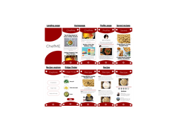 Color - Red |  Color - Blue |
|---|
2) LAYOUT DESIGN - INTERFACE TEMPLATE
 Template - Text base |  Template - Image base |
|---|
3) CONTENT DESIGN: AUTHORSHIP
 Content - User Generated |  Content - Firm Generated |
|---|
RESEARCH METHODS
12 Versions of the survey with different combinations of design elements
A randomized survey was distributed on social media platforms (e.g., Facebook and Instagram) to targeted groups. 199 volunteers (Mage=20.56, SD=2.50,45.2% female) participated in the survey about their perception of the ChefMe prototypes. 92.5% participants are undergraduate students, which is the target user group with 11.6% freshman, 22.6% sophomore, 28.6% juniors and 29.6% seniors. There are two main parts to the survey: 1) layout design 2) content authorship. Each participant received one of twelve versions of the survey. Each survey has a unique combination of the 6 different layout designs and 2 different content authorship.
Layout design includes colour and template. It focuses more on the overall visual design of the app. For colour, the variables are grey, red and blue. For interface templates, the variables are image-based layout and text-based layout. These variables are combined as they both fall under visual layout elements. The controlled variable is the content of the app.
Content authorship tests the user's perception of the source of the content. It focuses on recipe selection and choices. The controlled elements are the content, grey image-based layout and interactive user feedback section where users are allowed to comment and rate on the recipes. The two variables tested are the combination of firm and user-generated and user-generated only content.
Questions for layout design focuses on the overall perception and willingness for the app while questions for content authorship focuses on the perception and willingness for the recipes. Participants are asked to rate each statement in 5-scale Likert from strongly disagree (1), disagree (2), neutral (3), agree (4), strongly disagree (5).
EMPIRICAL FINDINGS


In the research, we found that colour does have significant impacts on the perceived usefulness of the app and the willingness to use and share while red is indicated as the colour most successful. For perceived usefulness, the colour red scored the highest (Musefulness=3.32, SDusefulnes=.68, p<.001). This shows that the use of colour red is impactful towards how useful users think of the ChefMe app. The colour red is also significantly impactful on users' willingness to use and willingness to share as red scores highest with the Mwillingness-to-use=2.86 and Mwillingness-to-share=2.61 respectively with blue next. However, colour does not have an impact on the ease of use. As seen, the results support the hypothesis that red is the most suitable colour for a food-focused app.
The results of the layout design show that the image-based interface template is more suitable for the ChefMe app as it has a higher ranking on perceived usefulness, ease of use and willingness to use and share. For usefulness, image-based has (Musefulness=3.26, SDusefulness=.55, p<0.001, 95% CI[.330, .695]), which shows that user's think an image-based interface seems more useful. Similarly, for ease of use, image-based has a (Mease-of-use=3.49, SDease-of-use=.63, p<0.001, 95% CI[1.059, 1.491]) indicating that user's find image-based interface templates easier to follow. Furthermore, the willingness to use and share is highest with image-based design with (Mwillingness-to-use= 3.11, SDwillingness-to-use=.67, p<0.00, 95% CI[.673, 1.090]) and (Mwillingness-to-share=2.81, SDwillingness-to-share=.74, p<0.001, 95% CI[.616, 1.040]). As seen, the result supports the hypothesis as an image-based interface template allows users to easily visualize all the functions creating a simplistic and representative screen.
The content authorship with a combined firm and user-generated was tested to be more effective for the ChefMe app. For usefulness, the combination of firm and user-generated content has a (Musefulness=3.44, SDusefulness=.56, p<0.00, 95% CI[1.109, 1.460]). Similarly, the combination of firm and user-generated content has higher perceived ease of use with (Mease-of-use=3.45, SDease-of-use=.56, p<0.001, 95% CI[.515, .894]). Moreover, for willingness to use and share, the combination of firm and user-generated content is more successful with (Mwillingness-to-use=3.17, SDwillingness-to-use=.57 ,p<0.001, 95% CI[.814, 1.165]) and (Mwillingness-to-share=2.89, SDwillingness-to-share=.64 ,p<0.001, 95% CI[.794, 1.164). This result supports the hypothesis that a combination of firm and user-generated content has a positive impact on overall perception and willingness as it provides credibility.
CONCLUSION
The result of this research shows that colour design, layout templates, and content choices do have a significant impact on users' perception of usefulness, ease of use and willingness to use, share. It shows that for the ChefMe app, colour red, image-based layout and a combination of firm and user-generated content has the highest rating of usefulness, ease of use and willingness to use and share. This research indicates that when designing food-related apps, these specific design elements should be carefully chosen. Red colour should be used as the base colour of the app design as it stimulates appetite and is often correlated with food-related services, so it creates a familiar and attractive app for users. An image-based layout should be utilized for an interface template as it provides users with a clear visual image of the details and functions of the app. A combination of firm and user-generated content should be incorporated for the content authorship as it provides credibility for the recipes while creating a community within the app. Therefore, for the design of the ChefMe app, a prototype with red colour, image-based app interface template will be implemented while including firm generated recipes along with user-generated comment section. Yet some of the limitations of this study is the lack of scope within the 3 tested variables. Many other elements within these 3 variables are also critical for user's perception, for example, consistency of interface layout, colour combinations and content design. Therefore, much research should be done to further investigate these three specific areas to find the best UX design for the ChefMe app.
REFERENCES
Denham @jess_denham, J. (2013, September 2). Can't cook, won't cook? A tenth of students never make their own food. Retrieved March 23, 2020, from https://www.independent.co.uk/student/news/cant-cook-wont-cook-a-tenth-of-students-never-make-their-own-food-8794409.html
Elliot, A. J., & Maier, M. A. (2014). Color psychology: Effects of perceiving color on psychological functioning in uumans. Annual Review of Psychology, 65(1), 95–120. doi: 10.1146/annurev-psych-010213-115035
Hunjet, A., & Vuk, S. (2017). The Psychological Impact Of Colors In Marketing. International Journal Vallis Aurea, (2), 42–54. Retrieved from https://www.ceeol.com/search/article-detail?id=598916
Lee, E.-Y., Lee, S.-B., & Jeon, Y. J. J. (2017). Factors influencing the behavioral intention to use food delivery apps. Social Behavior and Personality: an International Journal, 45(9), 1461–1473. doi: 10.2224/sbp.6185
To, P. (June, 2019). DH150 UX Design Final Project: ChefMe. Retrieved March 23, 2020, from https://bcpriscillato.wixsite.com/chefme
Singh, S. (2006). Impact of color on marketing. Management Decision, 44(6), 783–789. doi: 10.1108/00251740610673332
Wu, H., & Li, G. (2019). Innovation and improvement of visual communication design of mobile app based on social network interaction interface design. Multimedia Tools and Applications, 79(1-2), 1–16. doi: 10.1007/s11042-019-7523-6

PRISCILLA TO
I am Priscilla To, a UCLA class of 2020 graduate from Hong Kong. I majored in Business Economics with a minor in Digital Humanities, focused on UX design. I developed the idea of the ChefMe app for my UX Design course (DH150) and researched how and what design elements are best suited for a food-related app for my UX Research course (DH199). Feel free to contact me at priscillachto@gmail.com if you have any questions regarding my work!